All-Star Superman #6
Writer: Grant Morrison
Pencils: Frank Quitely
Inks & Colors: Jamie Grant
Letters: Phil Balsman
I have to say that after reading All-Star Superman #6, I was really impressed but did not necessarily perceive the same depth to the comic as in, say, Fables; at least insofar as detail in the art work and layered storytelling are concerned. When I read it for the second time I noticed that quite a few other things were going on that I hadn't picked up on the first time around. However, it was my third read through that led me to the very simple conclusion that I'm an idiot and should never have thought that first thought in the first place. Subsequently it occurred to me that having thunk it, and having no way of un-thunking it, I should certainly never write it down such that someone might, someday, discover my stupidity. And now I'm posting it online...
Thing is, I wasn't completely wrong to think the way I did when I first thought that first thought (Heidegger ain't got shit on me). See, I thought I was reading a comic, where in reality I was reading a fable. Fables are designed to be time bombs: one hears a fable and thinks nothing of it; it is only later that the fable’s true depth and complexity are revealed. This is accomplished in a kind of trickle-down, voodoo economic sort of way, a slow release at work on your brain. The fable’s presentation is such that one does not perceive untold depths, yet its constituent elements reverberate within one’s mind, producing resonances and echoes not typically produced by the average story. And, really, this fits in rather nicely with the purpose of the All-Star series: to tell tales that embody the heroes without concern for timelines, different versions of Earth or the confines of continuity. How better to accomplish such an end – the telling of the archetypical tale – than to write the comic as a fable? Assuming that my characterization of the series' intent is accurate, then Morrison, Quitely and Co. have done an absolutely bang-up job.
I don't much want to get into the story here because I really do think it's worth reading with the freshest eyes possible. Suffice it to say that this issue focuses on a critical moment in Superman's life, but not the Superman you think. (And if you can wrap your mind around what that means then you probably have no problem saying, "How much would could a woodchuck chuck if a woodchuck could chuck wood?" ten times fast.) Instead I want to address the visual element of the book, specifically the inking.
Now some people hate digital ink jobs and I understand their reasons. Occasionally it looks terrible and can ruin a book's entire feel. Like most of the factors that go into the creation of a good comic, the story, pencils, ink and letters all have to interact well in order for the comic to be truly successful. I will also admit that I don't necessarily understand every aspect of the inker's task and in discussing digital inking, I am rather further in the dark. Nonetheless, I love this comic's inking. There is a smoothness to the colors, a calming, placid quality that, even in the tensest of moments, gives the reader little cause for concern. It is as though nothing you see is any real peril, as if you are constantly being reassured that things – everything, really - will all work out in the end. Every color feels primary, but primary without any sharp edges. That really doesn't quite nail it, but I think I've somewhat put my meaning across.
On a final note I must tip my hat (which is, alas, across the room and makes my metaphor something of a falsehood) to Quitely's depiction of Superman. I absolutely adore – and this is a point made in any number of places, but one I first encountered on IGN – how much of a giant he makes Superman into while maintaining an air of gentleness. Even when not in uniform, Clark is a rather large man, but the stoop of his shoulders and the calm gait he maintains does not translate at all into raw, physical strength. Yes, this Superman is fantastically powerful and yet that power does not translate into danger. It's something you really have to see to believe.
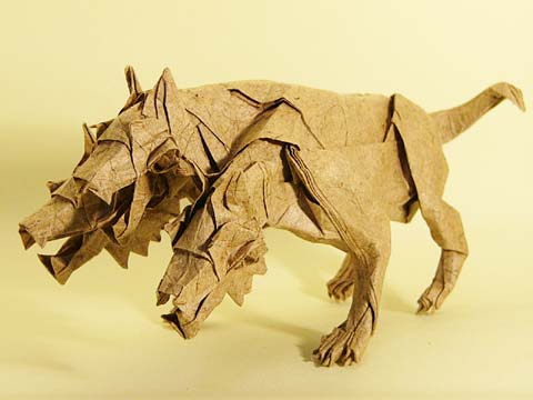
Plainly put this is one of the best comics around; I can't think of too many that can hold their own against it. Yet I would put it into something of a separate category from other books as by its very nature it has already been set apart. That's a debatable point so comment away (but just remember the middle head of the Cerberus is always right).
Ranking: Voltron and maybe something more.
^^^^ wondering what this ranking means? ^^^^
Subscribe to:
Post Comments (Atom)
8 comments:
grant morrison this, grant morrison that. for a three headed dog you guys sure have tunnel vision. Where are your warren ellises, ed brubakers, james jeans, and mike careys i aks you?
practicing chaos wizard? sure has enchanted you guys.
pshaw.
i did review Brubaker. hell, that makes me the only one to have reviewed an American in this little outfit. what's up with that? tunnel vision my slobbering central head.
I think you got your own wrongness right on target. snack on that nugget for a while.
dollars for donuts says Jake has no idea anyone has commented on our articles yet...
and you would be wrong
you fell for the oldest trick in the book, righty.
hehe, letterer: phil balsman. hehe, balsman
.... so you trace?
Post a Comment