Written by David B. Schwartz
Art and Lettering: Sean Wang
Color Art: Guru-eFX
Cover Art: Christ Bachalo (vol 1) & Greg Horn (vol 2)
Graphic Design: Rory Myers Design
Me: Hey guys, I'm having a hard time choosing what to review next for the site. Any suggestions?
Doug: Why don't you review something you didn't like.
Me: Well Meltdown it is then.
I'm not heartless or unfeeling… well maybe a little but only if its funny. That being said I really just couldn't find too much to like about Meltdown. The latest (air quote) super hero (end air quote) to get his own little special two part series from Image is a tired semi-redemption story that is as predictable as the artwork is just par. The boys at Image owe me a new pair of eyes since mine started bleeding when reading this saccharine laced tale. Diabetes is sure to follow.
While I didn't absolutely hate the book my disappointment is what really irks me. If you hate having endings given away stop reading now. I just don't care enough about this comic to not spoil the not-so-surprise ending. The story is a recap of Meltdown's life as he is about to die because of his power basically burning him to death from the inside out. From his arrival in Miami to his stint as a lackey in a group of superheroes called, with great lack of imagination, the Hall of Heroes we follow Meltdown from one sad story to another. The writing isn't bad. At times it almost makes you forget how crappy the plot is. But at the end of the second part we all can see where this is going from a mile away: Redemption. My god I wish they had just made him bad ass; Just to do something different.
"Well, I'm going to die. I've two options. A) Go all vigilante ala Charles Bronson in the Death Wish series but finally redeem myself at the end encouraging millions of people to be better than they are. Or B) Go all vigilante ala Charles Bronson in the Death Wish series and make my self a name as one bad ass mother fucker that wouldn't take shit off of anyone, possibly deterring a huge amount of people from crime and at the same time making myself the wet dream bad boy poster child for all women everywhere. Oh what the heck, lets go for A."
Stupid fucker.
As for the ink work it goes from cartoony during childhood flashbacks to dramatic while he is leaving his childhood sweetheart to oh-so-dark-and-brooding as he goes all emo about kicking the bucket. While that's faux innovative and all, there is no real sense of artistic expression, not even a little bit. The colors are either too bright to try to bring an ounce of happy to the good times or too dark to give angst in an angstless-post-apocoliptic-Mad-Max desert of emotion. Just seems flat and hokey… save for the fire. The artist apparently loves to digitally render fire since that is all they are good at. This, children, is digital ink done wrong.
Overall score: Lando. They could have done so much more with the idea of the book but just pussed out at the end.
What does this mean?
Wednesday, January 31, 2007
Wednesday, January 24, 2007
All-Star Superman #6
All-Star Superman #6
Writer: Grant Morrison
Pencils: Frank Quitely
Inks & Colors: Jamie Grant
Letters: Phil Balsman
I have to say that after reading All-Star Superman #6, I was really impressed but did not necessarily perceive the same depth to the comic as in, say, Fables; at least insofar as detail in the art work and layered storytelling are concerned. When I read it for the second time I noticed that quite a few other things were going on that I hadn't picked up on the first time around. However, it was my third read through that led me to the very simple conclusion that I'm an idiot and should never have thought that first thought in the first place. Subsequently it occurred to me that having thunk it, and having no way of un-thunking it, I should certainly never write it down such that someone might, someday, discover my stupidity. And now I'm posting it online...
Thing is, I wasn't completely wrong to think the way I did when I first thought that first thought (Heidegger ain't got shit on me). See, I thought I was reading a comic, where in reality I was reading a fable. Fables are designed to be time bombs: one hears a fable and thinks nothing of it; it is only later that the fable’s true depth and complexity are revealed. This is accomplished in a kind of trickle-down, voodoo economic sort of way, a slow release at work on your brain. The fable’s presentation is such that one does not perceive untold depths, yet its constituent elements reverberate within one’s mind, producing resonances and echoes not typically produced by the average story. And, really, this fits in rather nicely with the purpose of the All-Star series: to tell tales that embody the heroes without concern for timelines, different versions of Earth or the confines of continuity. How better to accomplish such an end – the telling of the archetypical tale – than to write the comic as a fable? Assuming that my characterization of the series' intent is accurate, then Morrison, Quitely and Co. have done an absolutely bang-up job.
I don't much want to get into the story here because I really do think it's worth reading with the freshest eyes possible. Suffice it to say that this issue focuses on a critical moment in Superman's life, but not the Superman you think. (And if you can wrap your mind around what that means then you probably have no problem saying, "How much would could a woodchuck chuck if a woodchuck could chuck wood?" ten times fast.) Instead I want to address the visual element of the book, specifically the inking.
Now some people hate digital ink jobs and I understand their reasons. Occasionally it looks terrible and can ruin a book's entire feel. Like most of the factors that go into the creation of a good comic, the story, pencils, ink and letters all have to interact well in order for the comic to be truly successful. I will also admit that I don't necessarily understand every aspect of the inker's task and in discussing digital inking, I am rather further in the dark. Nonetheless, I love this comic's inking. There is a smoothness to the colors, a calming, placid quality that, even in the tensest of moments, gives the reader little cause for concern. It is as though nothing you see is any real peril, as if you are constantly being reassured that things – everything, really - will all work out in the end. Every color feels primary, but primary without any sharp edges. That really doesn't quite nail it, but I think I've somewhat put my meaning across.
On a final note I must tip my hat (which is, alas, across the room and makes my metaphor something of a falsehood) to Quitely's depiction of Superman. I absolutely adore – and this is a point made in any number of places, but one I first encountered on IGN – how much of a giant he makes Superman into while maintaining an air of gentleness. Even when not in uniform, Clark is a rather large man, but the stoop of his shoulders and the calm gait he maintains does not translate at all into raw, physical strength. Yes, this Superman is fantastically powerful and yet that power does not translate into danger. It's something you really have to see to believe.
Plainly put this is one of the best comics around; I can't think of too many that can hold their own against it. Yet I would put it into something of a separate category from other books as by its very nature it has already been set apart. That's a debatable point so comment away (but just remember the middle head of the Cerberus is always right).
Ranking: Voltron and maybe something more.
^^^^ wondering what this ranking means? ^^^^
Tuesday, January 23, 2007
Doom Patrol, the Grant Morrison years
Writer: Grant Morrison
Editor: Bob Kahan
Illustrators: Various and too many to list here; I am not the Internet, do your own research.
So did you ever drink some $9 bottle of what can only be described as bathtub gin's younger and somewhat brain damaged cousin only to wake up to a hangover that once and for all proved to you how Salvador Dali got the ideas for his paintings? Let's face it, we all have. The heaving 'til nothing is left, the dry heaves afterwards, a world that seems to be working on an inverted axis… all this sound familiar? Well that's Doom Patrol as written by Grant Morrison in a highball glass with a twist of lemon. With such mind melting ideas as The Painting That Ate Paris (and it does) and super villains with powers listed as "every super power you never thought of," this gem of meta reality shows that not every superhero is, in fact, enviable. With the occasional exception of the main line super heroes from Marvel and DC (no one wants to be Ghost Rider…serious hair care issues) you rarely see heroes as pathetic or pitiful but still capable as the Doom Patrol. From Crazy Jane with her split personalities, to Robot Man who is a brain in a jar in a big steel suit, to Rebis the three minds melted into one body it's no wonder all these less than super heroes have issues that are far beyond your normal spandex clad do-gooder. But even with these very, very odd and very, very unique problems the Doom Patrol still manages to save the day in one way or another, even if they don't necessarily win every fight.
While this series isn't new, it has to be said that Grant Morrison has taken a wonderful series from his childhood and re-fleshed it for today's fans. His storytelling really shines through when tackling such complex ideas as the fifth horseman of the apocalypse removing words from the universe to bring about eventual cosmic destruction and the Scissor Men who cut people from time and space leaving just a big empty space in person's place, Morrison just can't seem to do anything wrong. The only part that could possibly be lamentable is that the ink work doesn't always match the creative story telling.
While the artwork is just on par with what is acceptable, with huge exceptions for the cover work and the occasional surrealist scene, the major selling point of Doom Patrol is the story. Most of the time you are left to guess what happens from one moment to the next. The remaining time you are flipping through a dictionary of philosophic terms to figure out just what the fuck they are saying. It's not a story to be read once and then skip to the next book; the story builds on itself, showing the huge mental scarring and self-doubt that rack all these not so super heroes. Superman may have had, literally, split personalities after coming back from the dead, but Crazy Jane has that beat with every personality manifesting its own individual super power. It's not an essential buy, but it does go to show how deep literally and philosophically that comics can go. My over all score is a Gimli. You could easily ignore this gem but if you want to see how far comics can go, you shouldn't miss this.
In case you have trouble reading I give this a Gimli.
What does this mean?
Sunday, January 21, 2007
The Immortal Iron Fist #2
Writers: Ed Brubaker & Matt Fraction
Artist: David Aja
Colors: Matt Hollingsworth
Letters: Dave Lanphear
Here we are at the start of a review and I've already lied at least twice by my count (and I dare you to disagree with my finger-based numerical analysis). Not only is David Aja not the only artist, but the coloring duty is similarly a shared position. Regarding the latter, Dean White colored the (somewhat) intersecting storylines, while there are three additional artists involved alongside Aja. Travel Foreman and Derek Fridolfs handled the first few pages and our introduction to an earlier Iron Fist, while John Severin took care of the insert of Orson Randall's adventures as Iron Fist during WWI. That said, it is truly David Aja's gorgeous work that makes this issue – as well as its predecessor – as wonderful as it is. He manages to create panels that are expressive, with a resemblance to movie stills (kind of a glamor shot approach) during the action sequences, with scenes that have the dialogue or evolving characterizations as a focus are reminiscent of a stop-motion film.
Nonetheless, the use of three different artists works very much to the issue's advantage. Not only is there a clear demarcation between the three featured time frames, but a certain extra flavor is added to the work; each version of the Iron Fist has its own depiction here, setting apart the circumstances and consequences of their reign as Iron Fist. Even Orson's use of the Fist's power, while disconcerting to Danny and by implication an unprecedented event, in the modern time demands depiction by the same artist that renders Danny's adventures. The reason for this is that while Orson is a different person employing the power common to all Iron Fists, his use in this time and space is not so much a reminder of his own time as bearer but rather an intrusion on Danny's tenure as champion. (As an absolute aside, however, I must praise John Severin for his work during the WWI depiction of Orson as Iron Fist. His style in this instance possesses characteristics rather reminiscent of Eric Wight's style in the initial The Escapist comic. The hard lines across the chest are rather reminiscent of that...to me, anyways.)
Obviously the storytelling is excellent at this juncture, otherwise all the outstanding art would have gone for naught. Gorgeous artwork can make up for a lot and is clearly a key component to a comic's success – it being better than half the equation from a certain perspective – but it cannot, under any reasonable circumstances really, be expected to make up for poor storytelling. Well, this story simply kicks ass. It has any number of hooks and mysteries surrounding it, while developing each and every character in a truly fantastic manner. An economy of motion is present that one does not often encounter. The interaction between Luke Cage and Danny Rand is practically a discussion of the difficulties of their previous affiliations, the pitfalls and fractures in their history, while establishing that both men have found a common ground, a shared understanding both agree upon. Cage can give Rand a hard time for being loaded and wanting to experience the hard-knock life, while Rand can explain it all away based on the quality of an eggroll. And it is made all the more impressive by accomplishing all of this in a matter of a few pages.
Against this backdrop, Orson's storyline certainly extends the mystery of this new Iron Fist comic, complicating an already complex situation – you know, just little ol' Danny versus Hydra – with his simple existence. Come to think of it, this may explain the story arc's deceptively loaded title: “The Last Iron Fist Story.” Maybe this is Orson's story, a rapping up of loose ends and the like. Just a thought, but there is absolutely something to be said for any series that spurs such speculation, forces the reader to imagine what could be. And this really is one of the series' strengths thus far: focusing on a single issue is nearly impossible because of the strength of the overall story arc thus far. On top of that each issue is bloody well loaded to bear, stuffed to the gills with fascinating tidbits of information and gorgeously subtle considerations. The veiled references to the Registration Act and the allusion to Tony Stark, though he goes unnamed, as “The Man” all serve to tie the series into current continuity while setting up interesting comparisons among the series' characters and those more established members of the Marvel Universe.
While I cannot wait to see how this arc plays out, I am a shade worried about how they tie it all up. Let's just say Uncanny does make me a touch twitchy. So my ranking is, perhaps, flawed, but I think it holds water for any number of reasons, mostly those enumerated above.
Ranking: Snake-eyes 'cause it's just so damn cool.
^^^^ wondering what this ranking means? ^^^^
Civil War #1
Title: Civil War #1
Writer: Mark Millar
Artist: Steve McNiven
A bombing at an elementary school. Reality teevee gone amuck. A beating outside of a night-club. Draconian political maneuevers designed to protect the populous and safeguard individual liberties which end up stripping away said freedoms and polarizing a country toward war. And this is just issue #1. Sounds like a selection of your everyday, garden variety newspaper headlines, and that is exactly the point. Millar's Civil War series begins uncomfortably close to home; it is socially and politically aware of the world we live in. The catch, of course, is that our world doesn't have any super-humans, or at least none that I'm aware of (my sincerest apologies to Tony Hawk and LaDanian Tomlinson). Millar's vision is simple: Take our world, its strife and tensions and add a dash of super-human might and then play things as straight as possible. What would Congress do to protect its people against individuals with tremendous power, whether they be self-proclaimed heroes or infamous villains?
The Registration Act is a gimmick, I get that. But it is an incredibly useful one. And don't tell me the idea of dividing up Marvel's mightiest heroes and having them face off against one another doesn't sound like a wee bit of fun. Sure these guys (and gals) have fought amongst one another before but never like this. Even a few hints of the massive war to come are enough to make Civil War #1 a necessary read. In fact the only thing that could dilute the potency of such a prospective story-line would be the forced perspective that we should favor one side over another. That we should be rooting for, say, Captain America, instead of someone like Iron Man. To this end Millar almost tips his hand too early. In a gorgeous full page McNiven rendering we see Cap surfing on a hijacked fighter jet. On the level of sheer coolness alone, how does one not root for this guy?
Yet any kind of resolution is a long way off, and purposefully so. The slate is clean, everyone's still a hero--for now. Civil War #1 does an excellent job of setting the table. The blueprint allows for unexpected defections, cameos, and plenty of startling revelations. The prospect of universe wide change where 'nothing will be the same' seems immediately realizable. Yet it's also a tired old cliche that rarely finds fruition in the comicbook world. With the seventh and final issue of Millar's opus to be released exactly one month from now, here's hoping Civil War comes through on the tremendous promise of it's opening chapter.
Rating: I give it a Snake-eyes <<<< wondering what this means?
p.s. check back durning the upcoming weeks for the reviews of subsequent Civil War issues while we at Cerberus countdown to the seventh and final chapter on February 21.
Friday, January 19, 2007
The Spirit #1
Written and pencils: Darwyn Cooke
Inks: J. Bone
Colors: Dave Stewart
Letters: Jared Fletcher
The Spirit #1 is fantastic. That's about as succinctly as I can put it. It's pretty much everything I could have possibly wanted it to be and then some. Hell, I didn't even know what I wanted it to be and not only did it say to me about halfway through, "Hey, this is what you wanted me to be," it also managed to say a few pages later, "Hey...this is the 'and then some'." Normally when comics start telling me what I should be thinking and/or to expose myself to radiation, I tend to take a deep breath and realize a lifetime of Hulk smashing is hardly as fulfilling as writing the occasional comic book review...OK, let's pass over that last bit in silence.
On with the reviewing: the art work manages to maintain a cartoon-ish, almost child-like feel without losing an ironic if not joyful sensibility. Very few hard edges or sharp lines exist in this book, yet none of the danger inherent in the story line is lost. The villain of the story, Amos Weinstock aka The Pill, is more grotesque and more dangerous because of the soft edges. Cooke's use of shadows is masterful; the light cast on The Pill's face, and the shadows thereby created, by the flames consuming the warehouse grant his appearance a clarity and focus not captured on a previous page's stretched panel close-up. In the latter, The Pill is certainly a twisted and disgusting figure, but not necessarily evil; he is monstrous, not a definite monster. Once the flames begin to spread and frame his face in the former instance, the later panel, who and what The Pill is becomes abundantly clear: a true monster. Every panel that really counts (and by this I mean those panels that introduce us to the story, push it further forward and emphasize the climatic elements) is wonderfully done – particularly the inclusion of the news ticker on the opening page and in return trips to the newscast; the news items related there are hysterical in their hyperbole, but very much ground this story in our world – and the layout, while not revolutionary like Miller's Dark Knight or particularly clever like that used in the recent Luke Cage focused issue of New Avengers, takes a very much no-frills approach, framing the art and dialogue but not interfering with or expanding the story. This is a traditional tale told with a modern sensibility and, as such, the presentation ought maintain a certain understated balance.
Insofar as the dialogue is concerned, Cooke maintains a bantering, intelligent approach that keeps the story moving while developing each character further. In many ways, the interaction between dialogue and art is some of the best I have seen in some time, particularly the use of visual cues to express intent and intonation. One can almost hear the sarcasm drip from the reporter's mouth as she mocks The Spirit or feel The Spirit's forehead furrow in confusion concerning his charge's manner of speaking. The overall story is a bit over the top, but that is perfectly appropriate considering the subject matter. I do have to mention, though, that I really cannot recall the last time I heard of a mob boss melting a man with his hands. All I can say is, "Moist." Sponges will never be the same again.
I frequently feel that a great comic cannot be reviewed particularly well purely in print (especially in this much print; shorter reviews really are so much better), so I will leave off by saying purchase this comic. It is a wonderful read that will seriously make your day. Does it change the genre forever? No. Is it better than sliced bread? Nope to that as well. But it is a wonderful read and the sum of its parts makes for a fantastic whole.
Ranking: Voltron all the way. <<< wondering what this means?
Tuesday, January 9, 2007
the seven point ratings system
Everyone knows the meat and potatoes of a Cerebus review is the words. However some sort of abreviated rating system makes sense, if for nothing else to provide a not so subtle means for the non-reading inclined to grasp exactly what we think. Comics will be judged on a variety of potential virtues, faithful character portrayal, art that makes sense, originality, a story that has good pacing, a one-shot that is a little universe unto itself, and more often than you'd think, a brilliant cover. And these are just a few of the criteria.
Now it is extremely difficult to baldly say that any individual issue of Spider-man is quantitatively better than, let's say, Mouse Guard. Therefore our seven point ratings scale isn't necessarily a 'from best to worst' scenario. Sure, there will be a top cow prize, and a bottom of the barrel stinker designation, but a majority of the grades will fall somewhere in between. For that we have scoured the halls of Geekdom and procured handy famous figures to stand in as symbols of sorts. Voila:
1. "______" An as yet un-named honor given to issues and collections that are genre defining. These works literally change the way artists and writers view their craft. We can't imagine handing too many of these bad boys out so for the time being this designation has no name.
2. a "Voltron." A comic graded as a Voltron has a lot working in its favor. In effect it has done everything right, its' excellent parts acheiving an even excellent-er whole.
3. a "Snake-eyes." A comic most agree is cool. Many a fanboy has a crush. Dissenters are born, but mostly these are just contrarians hating because most everyone else adores.
4. a "Gimli." Solid. but somehow overlooked. A Gimli is an unlikely success, a diamond in the rough, to borrow a phrase from the Onion, a future film that time forgot.
5. a "Lando." Great idea, poor execution. Something never translated from thought bubble to the page. A most frustrating comic.
6. a "Starscream." Annoying as hell to most, but like most everything, somebody out there loves it. Safe for fetishists of the hero(es)/villian(s) of the comicbook in question but to be avoided by everyone else.
7. "______" similar to our top cow prize is the Booby. It too is as yet un-named and a dubious honor. The comic in question is so bad as to have made the reader dumber. Minutes stolen from your life that you will never get back. A terrible idea, an awful realization. People are convicted of crimes against humanity for lesser offenses than this.
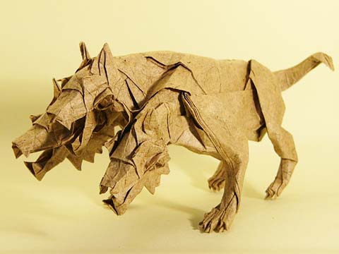
Howl
| Welcome to Cerberus Reviews, the bastard blog-offspring of Notions and Sundries. This site seeks to provide you, the visitor, with insightful, well-written, and brutally honest reviews of contemporary comicbooks. Occassionally we will critique collected works (trade paperbacks, deluxe Absolute editions, etc.) as well. And we fully encourage all the comments you can muster. These are opinions after all, and though we may be always right, we'll certainly give an ear to your differing views, as slanted and off the mark as they may be. The Cerberus is composed of: Douglas Riggs, a relative newcomer to the comicbook scene. The vociferous, sinister left head of the beast, last seen gushing over the rebooted JSA. Thomas K. Flynn, the All-father, the central head omniscient in the ways of comicbook lore. He's your hero. and Jake Cripps, the furry right head, bearded, belligerent, and terse. We've attempted sobering him up but try telling him there is such a thing as too much New Glarus. It isn't pretty. Look for the first of many reviews to arrive in the very near future as well as a finalized grading scale of how we'll be judging what we read. Thanks for dropping by, Douglas |
Subscribe to:
Posts (Atom)